01 — Logo
Logo & Wordmark
The HackLabs logo consists of an atomic orbit symbol paired with the wordmark "HackLabs" in Inter ExtraBold. Use the white version on dark/brand backgrounds; the dark version on light backgrounds.
White — on dark backgrounds
Dark — on light backgrounds
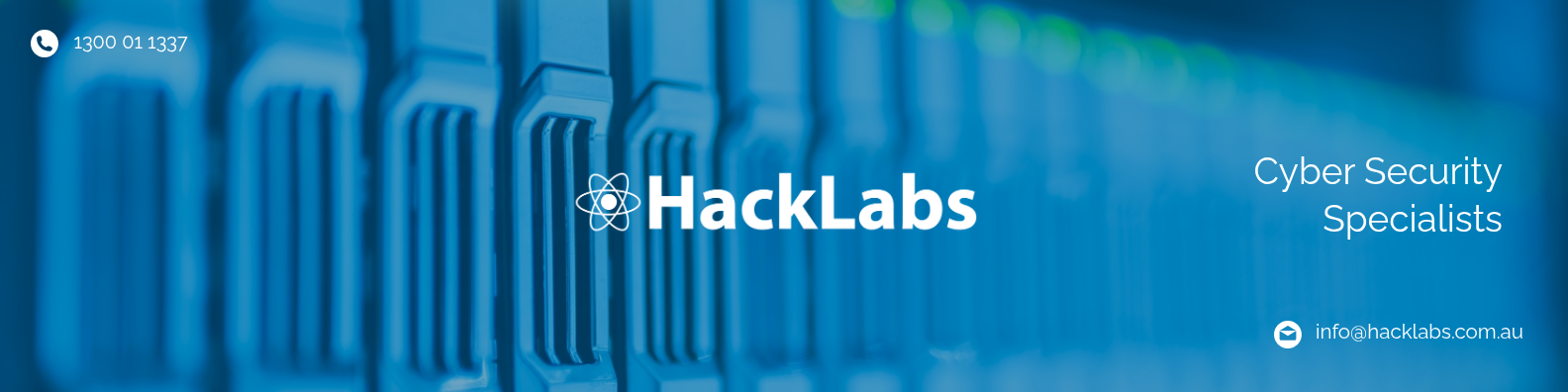
LinkedIn Banner (real-world logo in context)
Logo Usage Rules
Minimum size: 120px wide (digital) / 30mm wide (print)
Clear space: at least half the logo height on all sides
Never recolour the atom symbol — use white or brand purple only
Never stretch, rotate, or add effects to the logo
Do not place on busy photographic backgrounds without a dark overlay
02 — Colour
Colour Palette
The HackLabs palette centres on a deep indigo-purple brand colour, paired with near-black for text and clean whites and greys for surfaces.
Brand Colours
Brand
#403ab4 · rgb(64,58,180)
Primary buttons, links, icons, accents
Brand Light
#6b65ce · rgb(107,101,206)
Hover states, gradient midpoints, card fills
Brand Dark
#2d2980 · rgb(45,41,128)
Hover on primary buttons
Brand Deep
#302b63 · rgb(48,43,99)
Hero gradient midpoint, dark sections
Brand Deepest
#0f0c29 · rgb(15,12,41)
Hero gradient start, deep dark backgrounds
Neutral / UI Colours
Gray 900
#111827
Body text, dark sections, nav dark bg
Gray 700
#374151
Secondary text, labels
Gray 500
#6b7280
Body copy on light backgrounds, captions
Gray 400
#9ca3af
Placeholders, disabled states
Gray 200
#e5e7eb
Borders, dividers
Gray 50
#f9fafb
Page background, alternate section bg
White
#ffffff
Cards, panels, text on dark
Accent / Status Colours
Green 400
#4ade80
Success, positive indicators
Green 500
#22c55e
CREST/ASD badges, trust indicators
Yellow 400
#facc15
Warning states, highlights
Red 400
#f87171
Error states, critical alerts
Purple 300
#d8b4fe
Accent text on dark backgrounds
Purple 400
#c084fc
Highlight text on dark sections
03 — Gradients
Gradient System
Three defined gradients form the visual backbone of the brand. Use these consistently and do not freestyle other gradient combinations.
Hero Gradient
linear-gradient(135deg, #0f0c29 0%, #302b63 50%, #403ab4 100%)
Hero sections, full-width dark panels, proposal covers
Brand Card Gradient
linear-gradient(135deg, #403ab4 0%, #6b65ce 100%)
Featured cards, CTA panels, highlight boxes
Dark Brand Gradient
linear-gradient(135deg, #0f0c29 0%, #403ab4 100%)
Footer, section dividers, email headers
Official Branding Backgrounds (from Google Drive)
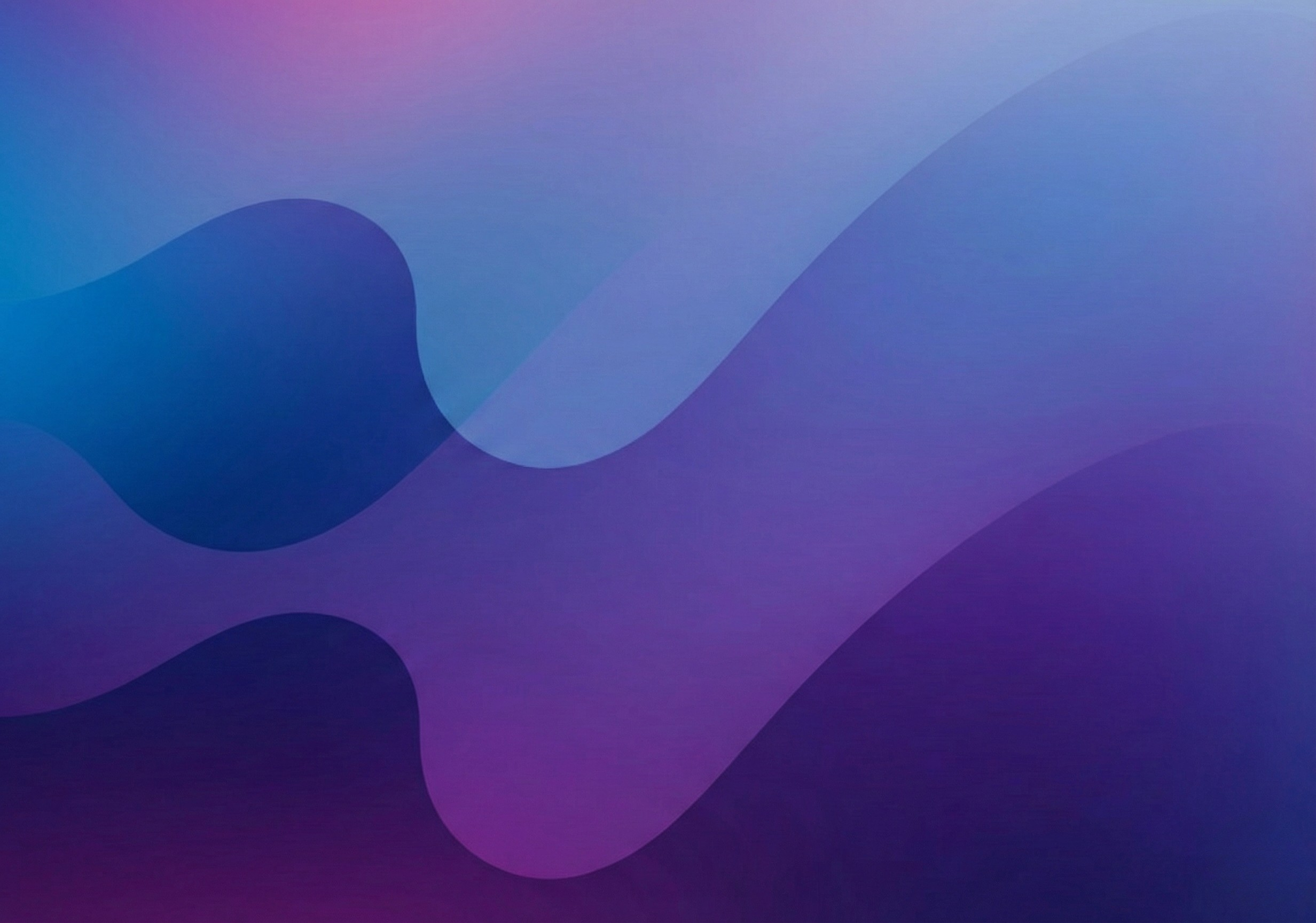
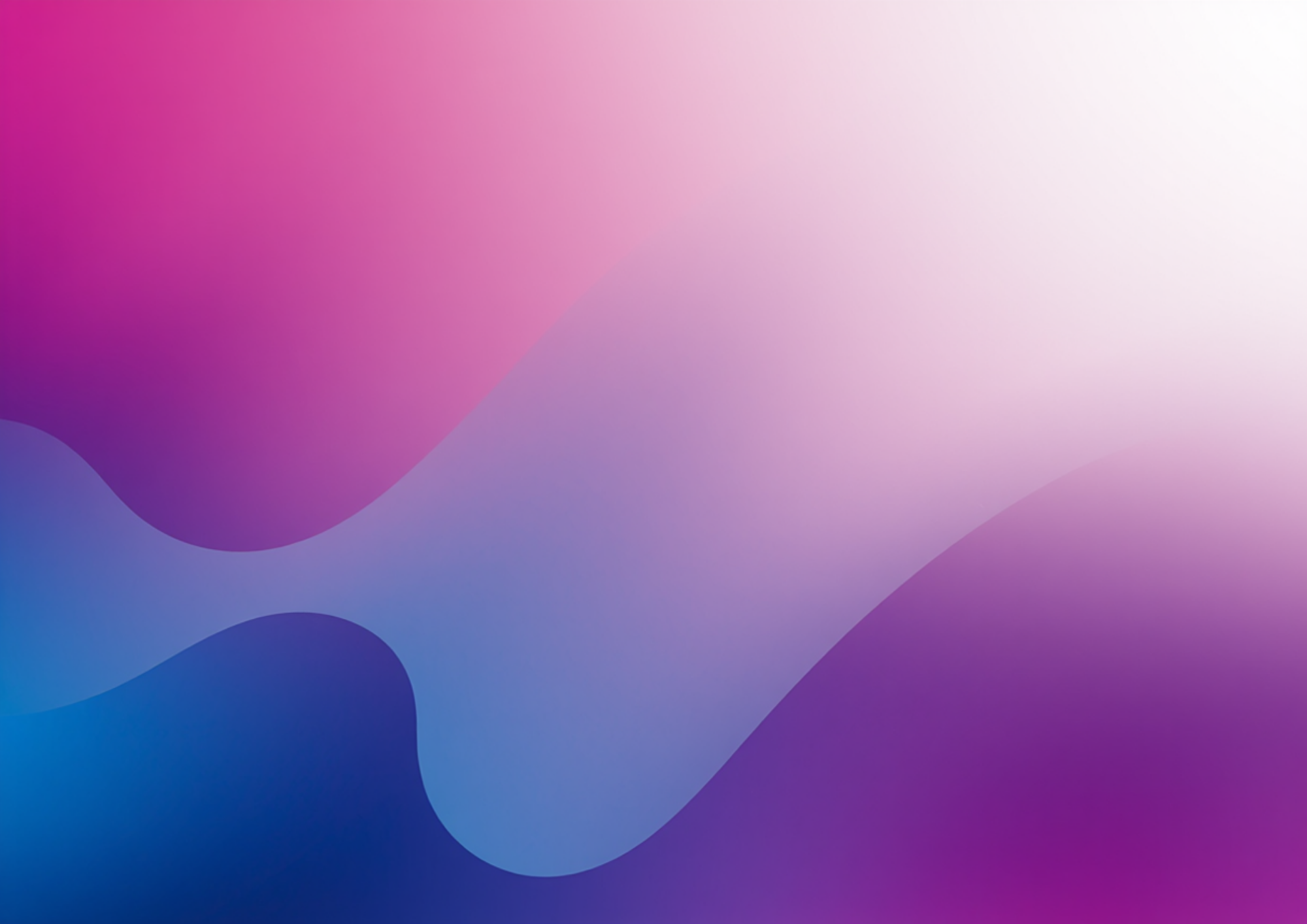
Background Template 1 — warm/bright
Background Template 2 — dark/moody
04 — Typography
Type System
Inter is the sole typeface across all digital and print applications. Use weight to create hierarchy — never size alone.
H1 — Display / Hero
On the Cutting Edge
Inter ExtraBold (800) · 48px/3rem · tracking -0.02em · line-height 1.1
H2 — Section Title
End-to-End Security Services
Inter Bold (700) · 36px/2.25rem · tracking -0.01em · line-height 1.2
H3 — Card / Sub-section Title
Penetration Testing
Inter Bold (700) · 24px/1.5rem · line-height 1.3
H4 — Label / Component Title
Full-Spectrum Security Coverage
Inter SemiBold (600) · 18px/1.125rem
Body — Regular
HackLabs identifies the technical, human, and physical vulnerabilities within your organisation — before attackers do. Australia's most trusted offensive security team.
Inter Regular (400) · 16px/1rem · color Gray 500 (#6b7280) · line-height 1.6
Small / Caption
CREST Certified & Accredited · ASD Assessed · 20+ Years Experience · Australian Owned
Inter Regular (400) · 14px/0.875rem · color Gray 400 (#9ca3af)
Overline / Section Label
OUR SERVICES
Inter Bold (700) · 11px · ALL CAPS · tracking 0.15em · color Brand (#403ab4)
Mono / Code
nmap -sV --script vuln target.corp.au
SFMono / Menlo / Courier New · 14px · color Brand · bg Gray 50
Google Fonts Import
https://fonts.googleapis.com/css2?family=Inter:wght@300;400;500;600;700;800&display=swap
Weights in use: Light (300), Regular (400), Medium (500), SemiBold (600), Bold (700), ExtraBold (800)
05 — Buttons
Button Styles
Use Primary for the main CTA on any section. Secondary for supporting actions. Ghost and outline variants for use on dark backgrounds only.
On Light Background
Get a Security Assessment
Our Services
Schedule a Call
On Dark Background
Get a Security Assessment
Our Services ↓
Learn More
Button Specs
Style
Background
Text
Hover
Primary
#403ab4
#ffffff
#2d2980
Secondary
transparent
#403ab4
border+fill brand
Dark
#111827
#ffffff
#374151
Ghost (dark bg)
rgba(255,255,255,0.1)
#ffffff
rgba(255,255,255,0.2)
Border radius: 8px · Padding: 0.625rem 1.5rem · Font: Inter SemiBold 600 · Size: 14px
06 — Components
UI Components
Core component patterns used across the website, proposals, and marketing materials.
Navigation Bar
Schedule a Call
Hero Section
CREST Australian · ASD Assessed
On the Cutting Edge
HackLabs identifies the technical, human, and physical vulnerabilities within your organisation — before attackers do.
Get a Security Assessment
Our Services ↓
Service Cards
Penetration Testing
Comprehensive offensive security testing across web applications, networks, cloud infrastructure, and mobile platforms.
Incident Response
Our IR team deploys rapidly to contain, investigate, and remediate — minimising your operations-level impact.
Red Team Operations
Full-spectrum adversary simulation combining physical intrusion, social engineering, and digital attacks.
Tags & Badges
CREST Certified
ASD Assessed
Australian Owned ✓
20+ Years
Web Application Security
Red Team
Cloud Security
07 — Spacing
Spacing Scale
All spacing uses a base-4 system (Tailwind defaults). Key spacings for consistency across layouts.
08 — Proposify Reference
Proposify Template Settings
Use these exact values when updating proposal templates in Proposify to match the website rebrand.
Accent / Brand Colour
#403ab4 — Use for headings, section title bars, table header backgrounds, and button fills
Secondary / Hover Colour
#2d2980 — Use for hover states and dark accent areas
Cover / Hero Background
Gradient: #0f0c29 → #302b63 → #403ab4 at 135°
If Proposify doesn't support gradients natively, use flat colour #302b63 as the cover background.
Body Font
Family: Inter · Body: Regular 400 · Headings: Bold 700 / ExtraBold 800
If Inter is not available in Proposify, use Lato or Nunito Sans as substitutes.
Text Colours
Body text: #374151 (Gray 700)
Headings: #111827 (Gray 900)
Subtext / captions: #6b7280 (Gray 500)
Text on dark/brand bg: #ffffff
Links / accent text: #403ab4
Table / Pricing Block
Header row background: #403ab4 · text: #ffffff
Alternate row: #f9fafb
Total row background: #403ab4 · text: #ffffff
Border colour: #e5e7eb
09 — Downloads
Asset Downloads
All brand assets are hosted on Google Drive. Anyone with the link can download.
 Dark — on light backgrounds